Overview
This page will discuss how panes are displayed on the screen visually. Then a high level discussion about the code that makes this happen.
Visually
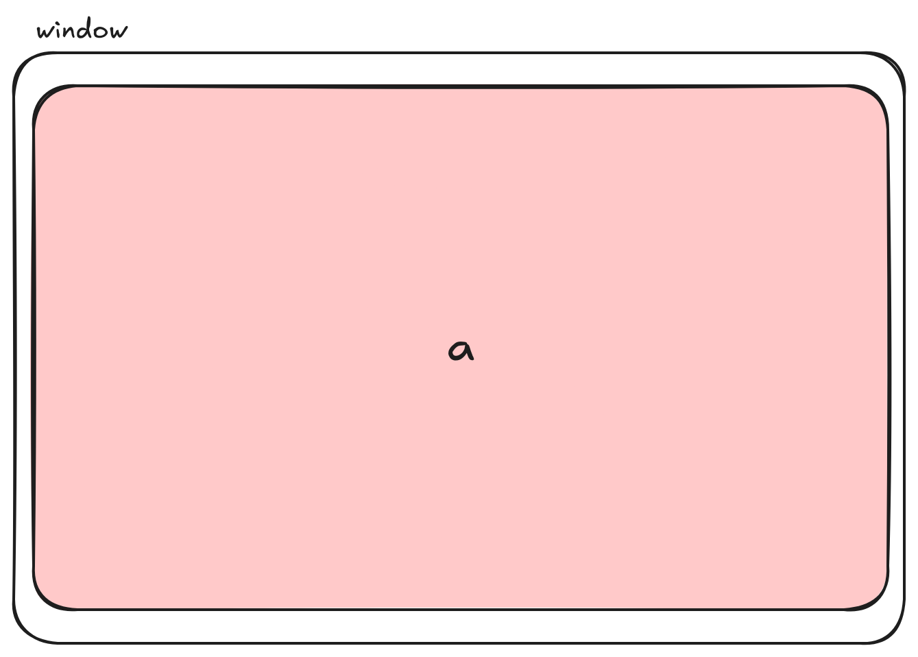
If you can understand the concept of a Pane the layout will make sense.The image below is showing a single Pane named a.
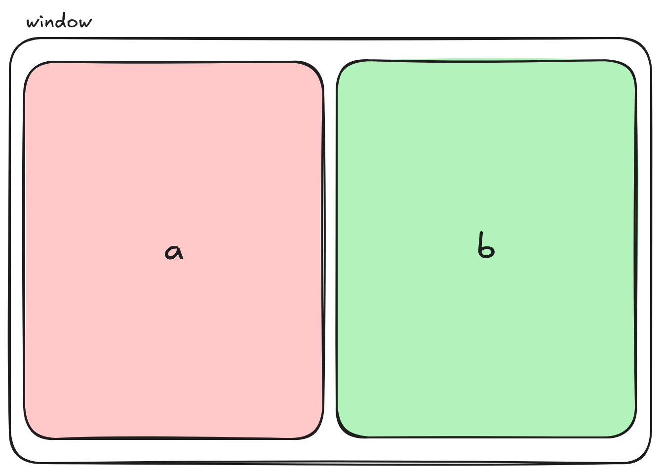
The below image is displaying 2 Panes split vertically. This was accomplished by instructing the PaneService to split Pane a vertically.
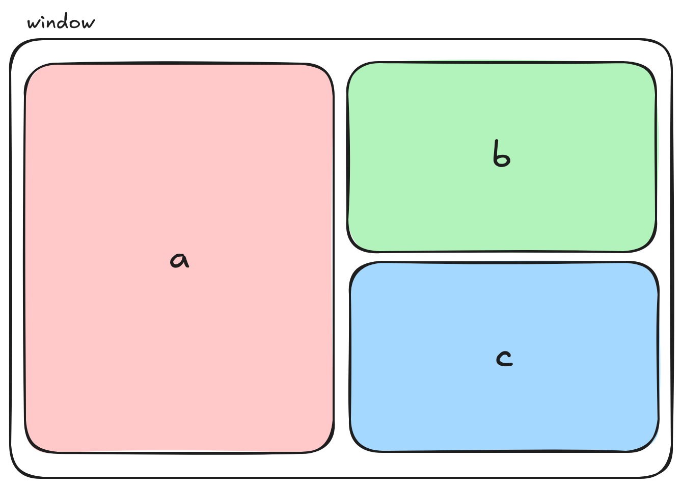
The below image is displaying 3. Now we split Pane b horizontally to get Pane b and Pane c. Again we instructed the PaneService to split Pane b
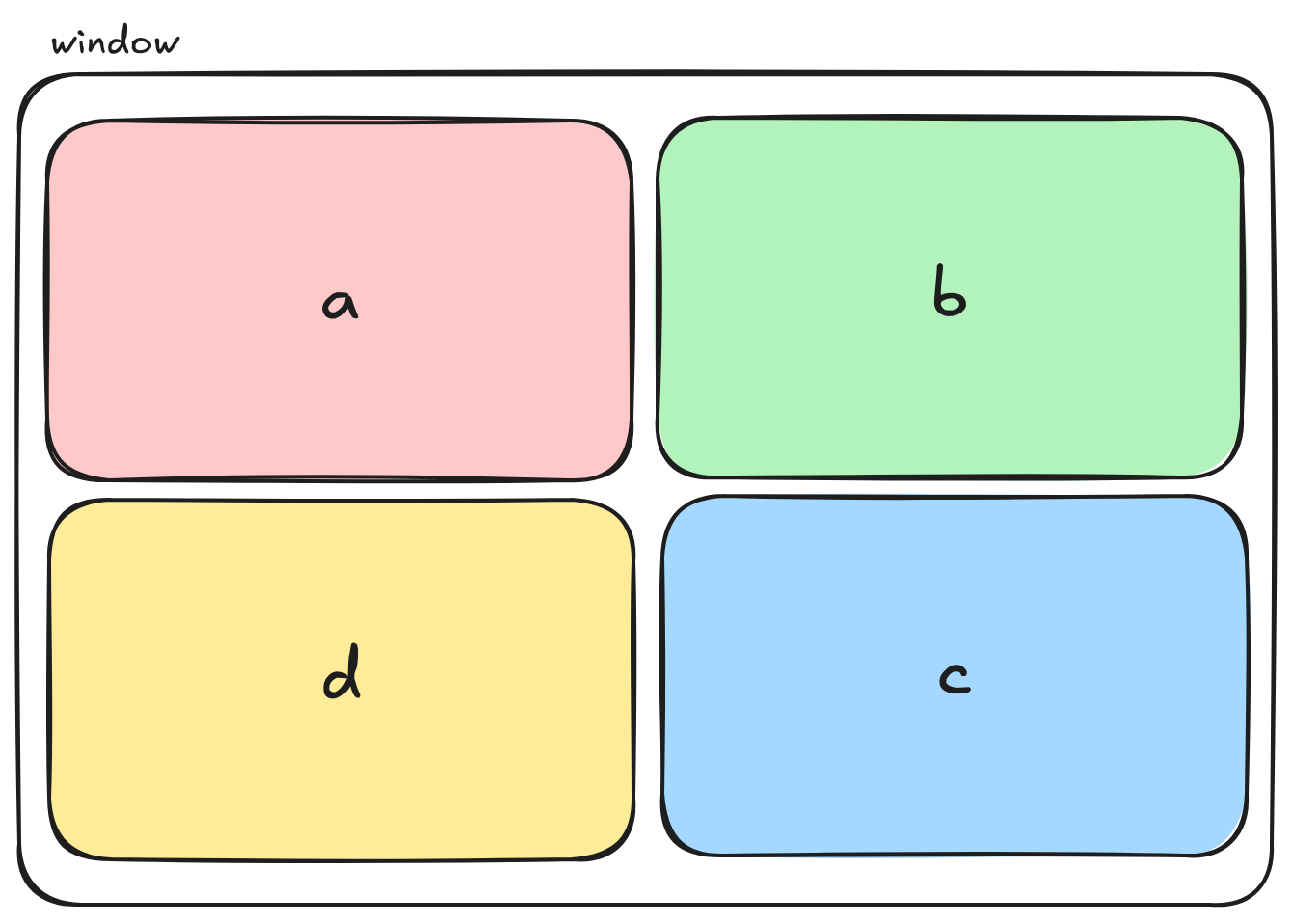
Lastly, the below image is displaying 4 Pane's. We split Pane a horizontally to get Pane a and Pane d. Again we instructed the PaneService to split Pane a
Pane Data Structure
The data structure used is the conventional Tree/Node
Note
Pane data structure is different than the Pane component.
/* pane.model.ts */
export interface Pane {
    id: string | any;
    left: Pane | any;
    right: Pane | any;
    split: string | any;
    buffer: any;
}
There are two types Panes. A branch Pane and leaf Pane.
A Simple Example
let root = {
            split: 'v',
            left: {
                id: 'a',
                buffer: {},
            },
            right: {
                id: 'b',
                buffer: {},
            }
        }
Branch Pane
A branch Pane only contains a left and right pane and a split.
In the example above, the left and right Panes are a and b with a vertical split (v is vertical).
Leaf Pane
A leaf Pane contains an id and a buffer.
In the example above the left Pane is a and the right Pane is b.
Note
A buffer a data structure holds the information about what Module to display in the Pane i.e. Chapter, Search, Modules etc...
DOM rendering
How do we render the panes in the DOM and what considerations needed to be considered?
Grid Template Area
checkout the MDN docs for 👉 grid-template-area docs. The grid-template-areas CSS property specifies named grid areas, establishing the cells in the grid and assigning them names.
grid-template-area examples
example1 {
    grid-template-areas:
                "a a a"
                "b c c"
                "b c c";
}

example2 {
    grid-template-areas:
                "b b a"
                "b b c"
                "b b c";
}
What we do to render the Panes in the proper position is recursively render a grid-template-area similar to the above example from the Pane tree/node data structure discussed in the section above. The constraint placed on rendering the grid-template-area is the ratio of each area must be respected.
Important
The algorithm used to render the grid-template-area is in the dynamicGrid.service.ts file. It's a recursive algorithm that starts at left leaf node and joins the left and right leafs at the branch node all the way up the tree respecting the area ratios.
A Visual Example
A single Pane grid-template-area would look like this.👇
example {
    grid-template-areas:
                "a";
}
let root = {
    id: 'a',
    buffer: {},
}
Splitting Pane a vertically grid-template-area would look like this.👇
example {
    grid-template-areas:
                "a b";
}
let root = {
            split: 'v',
            left: {
                id: 'a',
                buffer: {},
            },
            right: {
                id: 'b',
                buffer: {},
            }
        }
Splitting Pane b horizontally grid-template-area would look like this.👇
Note
See how Pane as area spans row 0 and row 1. This keeps the ratio of panes correct. The height of a is twice the size of b or c.
example {
    grid-template-areas:
                "a b"
                "a c"
}
let root = {
            split: 'v',
            left: {
                id: 'a',
                buffer: {},
            },
            right: {
                split: 'h',
                left: {
                    id: 'b',
                    buffer: {},
                }
                right: {
                    id: 'c',
                    buffer: {},
                }

            }
        }
Splitting Pane a horizontally grid-template-area would look like this.👇
Note
See how Pane as area reduces after adding Pane d
example {
    grid-template-areas:
                "a b"
                "d c"
}
let root = {
            split: 'v',
            left: {
                split: 'h'
                left: {
                    id: 'a',
                    buffer: {},
                },
                right: {
                    id: 'd',
                    buffer: {}
                }
            },
            right: {
                split: 'h',
                left: {
                    id: 'b',
                    buffer: {},
                }
                right: {
                    id: 'c',
                    buffer: {},
                }
            }
        }
HTML for grid-template-area
The html for grid-template-areas will look similar to this.
<div class="grid">
  <div style="grid-area: a;">a</div>
  <div style="grid-area: b;">b</div>
  <div style="grid-area: c;">d</div>
  <div style="grid-area: d;">d</div>
</div>
.grid {
    display: grid;
    grid-template-areas:
                "a b"
                "d c"
}
Dynamically
Dynamically we track the pane ids in a string[] and render the pane to the DOM this way. 👇
{#each panes as paneId}
            <div style="grid-area: {paneId};">
            <PaneContainer {paneId}></PaneContainer>
        </div>
{/each}
Danger
This is great but there is a constraint we must adhere to about rerendering panes in the DOM that do not need to be rerendered. For example if we delete Pane b then Pane c should fill the area of b. If the panes array changes, Pane b is deleted in this example, then Pane d is now in index 2 of the array then Pane d will be rerendered causing issues. Notably, if Pane d was displaying a bible chapter and the user had scrolled to the middle of the chapter, rerendering Pane d would then have the scroll set to 0 resulting in the first verse being displayed instead of the middle of the chapter.
Prevent DOM From Rerendering Panes
To remedy the issue of rerendering the Panes that should not be rerendered we never remove a Pand id from the panes array. Instead we track the deleted panes and conditionally choose not to display them. See below 👇
{#each panes as paneId}
    {#if !deletedPanes[paneId]}
        <div style="grid-area: {paneId};">
            <PaneContainer {paneId}></PaneContainer>
        </div>
    {/if}
{/each}
Defining Pane Height
In HTML/CSS you have to specify the height of an element otherwise the height will be sum of the height of inner html. For us since we generated the grid-template-area we know exactly the height of each Pane by adding up the number of rows the Pane id is present and dividing by the total number of rows to get the percentage of the view height.
In the code (in +page.svelte, onGridUpdate function), we determine the height of each Pane and publish the height of the Panes. Each Pane subscribes to this publish event and will update the Pane height accordingly.